Google New Logo 2015, Unveiled! Do you like it?
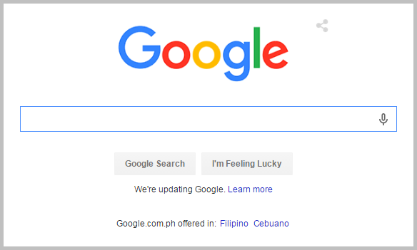
Just a few hours ago, Google's latest corporate logo design went live on all of the company's homepages across the world. Here's how it looks on Google Philippines search page:

Described by the company as "simple, uncluttered, colorful, and friendly" (just like Google itself), this 2015 version is - interestingly enough - the first to employ Sans Serif font -- albeit retaining the flat look of the well-received 2013 iteration.


The choice of typeface is in line with what the logo of Google's freshly launched parent company - Alphabet - has. And from the looks of it, all of the logos for Alphabet's current and upcoming ventures will likewise make use of this font. Just a hunch.

For those who are wondering, Alphabet is a new company by Google Founders Larry Page and Sergey Brin that will serve as an umbrella corporation that's on top of multiple ventures, including Google.
If you notice, within the past several years, Google itself has started several projects that appear to somehow depart from its original identity as a mere search engine; Gmail, Android, Nexus, and Google Glass are only some examples. Moving forward, Alphabet will be the one to manage all these businesses and many others that are still incubating.

Going back to Google's new logo: The animated GIF above shows the design's dynamism, which also reflects the brand's active presence in various platforms.
To quote the company, "As you’ll see, we’ve taken the Google logo and branding, which were originally built for a single desktop browser page, and updated them for a world of seamless computing across an endless number of devices and different kinds of inputs (such as tap, type and talk). [...] It doesn’t simply tell you that you’re using Google, but also shows you how Google is working for you. For example, new elements like a colorful Google mic help you identify and interact with Google whether you’re talking, tapping or typing. Meanwhile, we’re bidding adieu to the little blue “g” icon and replacing it with a four-color 'G' that matches the logo."
Do you like the new Google logo, TP Friends? I do. If you look at TechPinas' logo design, it's obvious that I'm fan of Sans Serif typeface, of subtlety, and of effective use of colors. But again, that's just me. Let me know your thoughts via our comments section below.

Described by the company as "simple, uncluttered, colorful, and friendly" (just like Google itself), this 2015 version is - interestingly enough - the first to employ Sans Serif font -- albeit retaining the flat look of the well-received 2013 iteration.

The Google Logo: Though The Years

The choice of typeface is in line with what the logo of Google's freshly launched parent company - Alphabet - has. And from the looks of it, all of the logos for Alphabet's current and upcoming ventures will likewise make use of this font. Just a hunch.

For those who are wondering, Alphabet is a new company by Google Founders Larry Page and Sergey Brin that will serve as an umbrella corporation that's on top of multiple ventures, including Google.
If you notice, within the past several years, Google itself has started several projects that appear to somehow depart from its original identity as a mere search engine; Gmail, Android, Nexus, and Google Glass are only some examples. Moving forward, Alphabet will be the one to manage all these businesses and many others that are still incubating.

Going back to Google's new logo: The animated GIF above shows the design's dynamism, which also reflects the brand's active presence in various platforms.
To quote the company, "As you’ll see, we’ve taken the Google logo and branding, which were originally built for a single desktop browser page, and updated them for a world of seamless computing across an endless number of devices and different kinds of inputs (such as tap, type and talk). [...] It doesn’t simply tell you that you’re using Google, but also shows you how Google is working for you. For example, new elements like a colorful Google mic help you identify and interact with Google whether you’re talking, tapping or typing. Meanwhile, we’re bidding adieu to the little blue “g” icon and replacing it with a four-color 'G' that matches the logo."
Do you like the new Google logo, TP Friends? I do. If you look at TechPinas' logo design, it's obvious that I'm fan of Sans Serif typeface, of subtlety, and of effective use of colors. But again, that's just me. Let me know your thoughts via our comments section below.

