Vivo Mobile New Logo, Font, and Pantone Color, Revealed! New Year, New Branding!
Chinese tech giant Vivo Mobile is jump-starting 2019 by changing its corporate look or branding -- from its logo all the way to its official pantone color!
The landmark redesign will be first implemented in China within just a few days from now and it will go global come March 2019.

Vivo's new logo actually looks almost identical to the old one but it does have subtle differences.

If you notice in the comparative image below, the old logo's typeface has rounded corners while the new one has sharper sides and corners. Also, the updated version is a bit more compressed vertically or slightly flattened.

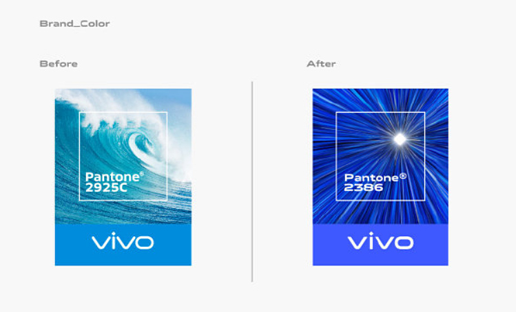
As for the corporate color, the new Pantone is 2386, which is close to Aquamarine. In comparison, the previous 2925C Pantone is akin to Cerulean.

You all know that Blue is my favorite color -- and I actually prefer this new tone.

To me, it just looks more striking and eye-catching even from afar.

Vivo Mobile created its own typeface or font, which it will start implementing on the packaging and promotional materials for its first smartphone release this year.

Vivo Apex 2019 flagship Android smartphone will be officially unveiled on January 24, 2018 via an exclusive media event in China.

Vivo Mobile is one of the most popular and best selling smartphone brands here in the Philippines currently -- so I'm sure that many Filipinos will be excited to see what's new about the brand as we begin 2019.
What do you think about Vivo Mobile's new logo, font, and corporate color? Let me know your thoughts by writing them down in comment section below or by messaging me on Facebook, Twitter, or Instagram. Cheers!
The landmark redesign will be first implemented in China within just a few days from now and it will go global come March 2019.

Vivo's new logo actually looks almost identical to the old one but it does have subtle differences.

If you notice in the comparative image below, the old logo's typeface has rounded corners while the new one has sharper sides and corners. Also, the updated version is a bit more compressed vertically or slightly flattened.

As for the corporate color, the new Pantone is 2386, which is close to Aquamarine. In comparison, the previous 2925C Pantone is akin to Cerulean.

You all know that Blue is my favorite color -- and I actually prefer this new tone.

To me, it just looks more striking and eye-catching even from afar.

Vivo Mobile created its own typeface or font, which it will start implementing on the packaging and promotional materials for its first smartphone release this year.

Vivo Apex 2019 flagship Android smartphone will be officially unveiled on January 24, 2018 via an exclusive media event in China.

Vivo Mobile is one of the most popular and best selling smartphone brands here in the Philippines currently -- so I'm sure that many Filipinos will be excited to see what's new about the brand as we begin 2019.
What do you think about Vivo Mobile's new logo, font, and corporate color? Let me know your thoughts by writing them down in comment section below or by messaging me on Facebook, Twitter, or Instagram. Cheers!

